
The Median is Not Your Market
There's a metric called AMI that drives billions of dollars in real estate decisions. It's not wrong - it's just incomplete in a way that matters.
Area Median Income (AMI) is the midpoint household income for a given city or region - published annually by the federal government. Half of households earn above it, half below it.
Real estate investors use it as a proxy for whether renters in a given area can afford their apartments. High AMI = healthy market. Rising AMI = raise rents.
Simple, intuitive, widely used. Also insufficient.
Why the Middle Doesn't Tell the Whole Story
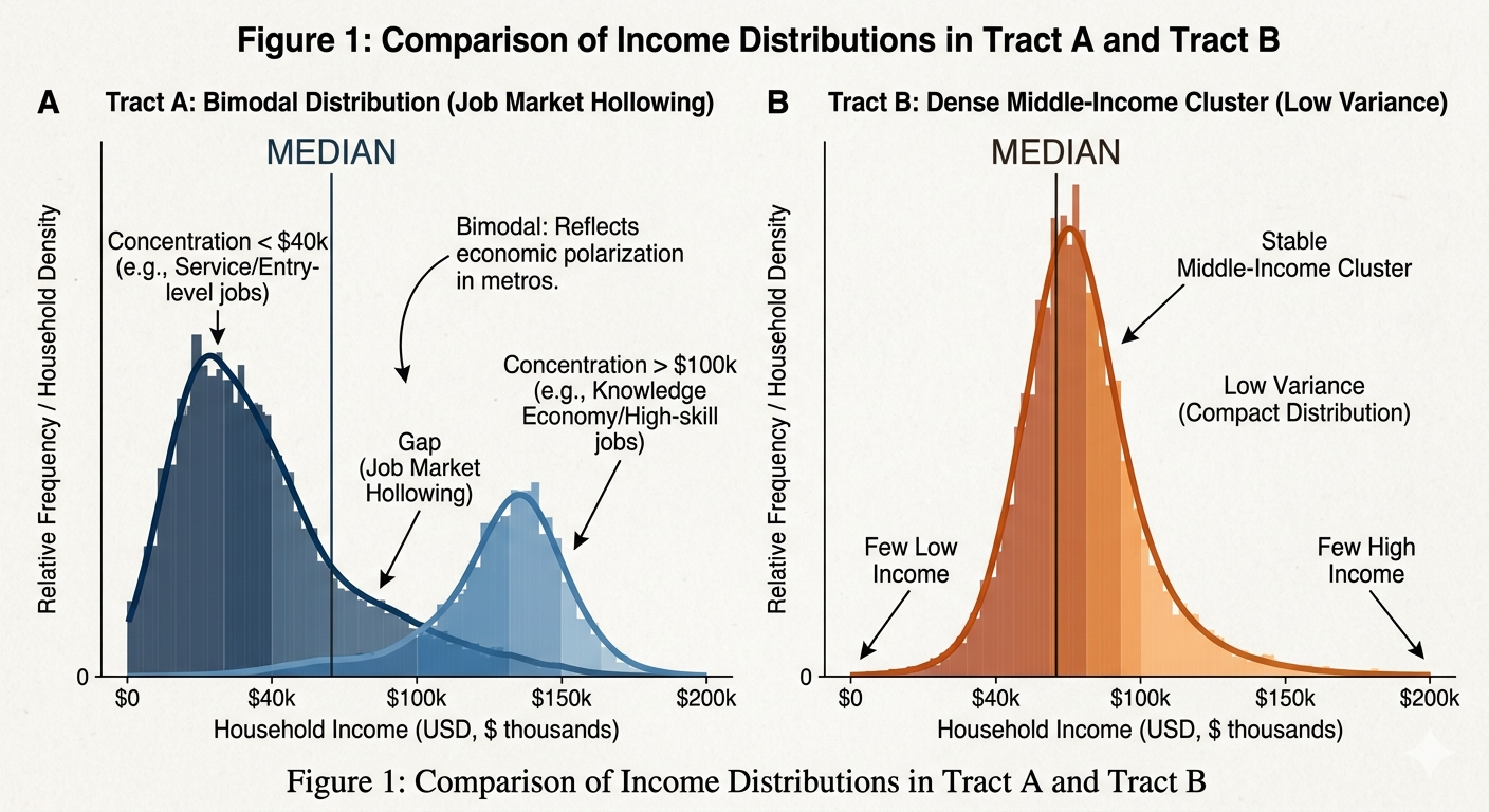
Imagine two neighborhoods, both with a median household income of $65,000.
In Neighborhood A, most households earn either under $40,000 or over $100,000 - with very few in between. Think: a gentrifying area where longtime lower-income residents live alongside newly arrived high earners.
In Neighborhood B, most households cluster right around $60,000–$70,000. A stable, working-class community with consistent incomes.
Same median. Completely different rental markets.
If you're renting apartments at $1,200/month, a household needs to earn roughly $48,000/year to afford it without being cost-burdened (the standard rule is housing shouldn't exceed 30% of income).
In Neighborhood B, maybe 38% of households clear that bar.
In Neighborhood A, maybe just 15% do.
That's the difference between a deep renter pool and a thin one - and AMI doesn't show it.
Then What Data Actually Helps?
The Census Bureau publishes a table called B19001 that breaks household incomes into 16 specific brackets - not just a single average - down to the neighborhood level. You can see exactly how many households earn $35,000 - $40,000, how many earn $50,000 - $60,000, and so on.
The federal housing department (HUD) publishes a companion dataset called CHAS that goes further, showing what share of households fall into specific affordability categories relative to local income benchmarks.
Together, these two free, public datasets let you answer a question AMI never can: How many households in this specific neighborhood can actually afford this specific rent?
Why This Matters Right Now
Over the past two decades, wage growth in the U.S. hasn't been evenly distributed. Higher earners have seen stronger gains. Lower and middle-income households - roughly the bottom 40% of earners - have seen their real purchasing power stagnate or decline, especially when you factor in how much rents have increased.
Workforce housing - the kind of modest, affordable apartments that make up most of the rental market - is primarily occupied by households in that lower-middle income range. When investors underwrite 3–4% annual rent growth, they're betting that renters can keep absorbing those increases.
In many neighborhoods, that bet is shakier than the median income number suggests. AMI can look healthy while the specific households your building depends on are getting squeezed.
The Bottom Line
AMI is a starting point, not an answer. It's like judging a city's traffic by its average commute time - technically accurate, practically misleading if you don't know whether most people are commuting 20 minutes or two hours.
The granular data exists, it's free, and it takes less than an hour to pull. Most real estate investors aren't using it.
That gap - between the data people rely on and the data that's actually available - is where investment theses get built or broken.
Paul Laughlin Jr. is the founder of LaughlinRE LLC, a real estate advisory firm based in Northwest Arkansas specializing in multifamily acquisitions, asset management, and portfolio strategy for family offices and middle-market investors.